AH..Finally have my painting corner all fixed up!!

I’m all set up and ready to roll.  My helper “Turkey” is making sure everything is there for me.  So Lets just say the upstairs bedroom did not do the job.  It was very  dark and very cramped.  Hated to go in there.  I moved it all downstairs.. set up a big table so I can spread out.. yeah.

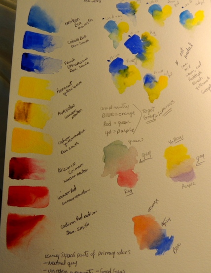
Paint palette used a mixture of Windsor red/ Aureolin /  French Ultramarine and cobalt blue..  this is it!  Still keeping in mind working with mouse colors.  I think this is why I choose this white flower to paint those “grays” but finding it is harder than it looks.  I’m virtually new to this even though I use to paint about 10 years ago.

white flower 006 white flower 007

white flower 011 white flower 014

I know this painting so far looks very soft in color but it is very  yellow in real life.  The yellow is very washed out in the picture.white flower 015

Painting number two using the same picture for inspiration but going its own way.  Very blue/purple with some yellow, I had hoped it would be more realistic like the picture.  I guess painting “white” is not as easy as it looks. lol.  I’m going to focus on these two and just go with it.  Maybe once the back ground is added it will look better.  After wards I just may give it another try.   To see if I can get that perfect greyish color to make this white flower look as it should.

white flower 016 white flower 017 white flower 018 white flower 019

Mouse Colors: learning

Well, let me share something with you.  I “thought” I wanted to paint glass bottles..  I started and realized I was way out of my league.   What a mess!  Such an advance painting project for an essentially  a beginner.  Although I painted regularly years ago and did ok.  It is very much apparent to me I need to get my watercolor  knowledge back.   So I carefully put away my glass bottles…  and pulled out my painting palette to experiment .  I’m keeping it to just 6 colors at the moment.  I also pulled out one of my favorite books by Jeanne Dobie “MAKING COLOR SING”.

Today just sharing my “experimentation” with my 6 colors… She has a chapter describing luminous grays.   By mixing your one of your primary colors with their compliment you can create these most gorgeous grays.   This is just experimenting, and as I look at this loose painting it  probably could use more detail.. It is suppose to be a mountain  scene, ( I’ve included a close up view of the top of this painting)   I followed her example to work on my mixtures.  It is a beginning..  trying to get what is in my head down on paper.  I figure every time I paint it will help, and I will learn.  Watercolors can easily turn to muddy colors so easily So I’m in great need to figure out how NOT to do that! .. I want beautiful colors..

DSCN7490 DSCN7489

DSCN7491

This  picture just shares the mixtures done today  along with my mixtures of mouse colors.   These grays are not neutral by any means, they actually have colors to them, they can be cool , warm, greenish, reddish,blueish,  at any intensity needed..

This is what has pulled me to watercolor is the gorgeous luminosity,  I don’t want to simply copy a scene I want to create a scene from reality.  Make it artistic if this makes any sense.

DSCN7487 Let me show you the picture of what I wanted to attempt… took lots of great pictures to do later!! What was I thinking??? lol  Someday I’ll go back to it.